Components
Every component in the kit on one page, grouped by what it does, with the groups and what is in them A to Z. There is no code to copy: your agent reads the markup from the kit's docs.
01–03
Buttons
- 01
Primary button
.btn, .btn-group, data-tipThe one filled button, for the single main action of a view. Hover brightens it. In a group it comes first, with secondary buttons after it.
On its own
In a group
With a hover label: hover or tab to it
- 02
Secondary button
.btn-outline, .btn-group, data-tipEvery other action beside the primary one, at the same size: presets that fill a form, Choose…, Open in Finder. Outlined, filled on hover.
On its own
In a group
With a hover label: hover or tab to it
- 03
Tertiary button
.btn-outline--tertiaryA quieter secondary button, for an action repeated many times on a page, such as the button on each card. Medium weight and a size smaller, in the same box.
On its own
In a group
With a hover label: hover or tab to it
04
Calls to action
- 04
05
Cards
- 05
Card grid
.card-grid, .cardA few linked things. Four cards sit two across from 768px and stack on a phone; three sit three across from 1024px. Home has it under Reading.
- 01
A type specimen
A one-page specimen for a serif family, set at every size the system uses, from 14px captions up to the display hero. Each line is live text.
Read this - 02
Field notes
A short essay on working with a single typeface, from notes kept over a year of small projects. What one family can carry when weight and size do all the work.
Read this - 03
One family, many voices
Verdigris sets everything in Cormorant, and gets its range from light, italic and semibold.
Read this - 04
The green that copper grows
How a pigment made with vinegar gave this theme its name.
Read this
- 01
06–10
Feedback
- 06
Activity indicators
.eq, .spinnerThe equalizer marks what is playing now; the spinner says something is loading.
Now playing
- 07
Dialog
.dialog, <dialog>The browser's own modal dialog: the page behind goes still, Escape or a click outside closes it, and focus comes back here. For a choice that needs an answer before going on.
- 08
Icon actions
.icon-row, .icon-btnIcon-only links and buttons under a list item, one color, the accent on hover.
- 09
Output panel
.output, .output-logA task's live output: a status beside the heading, a spinner while it runs, and the log in a dark block that scrolls. See it run on Forms.
Output
Finished
$ export 2026-10-01 2026-10-15 Saved exports/2026-10-01-item-01.jpg Saved exports/2026-10-01-item-02.jpg Saved exports/2026-10-01-item-03.jpg Skipped notes.txt: not an image - 10
Toast
.toastA one-line confirmation at the bottom left, gone after a few seconds.
11–16
Forms
- 11
Date and time
.field, type="date", "time"The browser's own date and time inputs as fields, with their calendar and clock. The format follows the visitor's settings.
- 12
Field
.field, .field-labelAn underline in large type, no box. A required field gets the flower mark after its label.
Required
- 13
File picker
.file-pick, .file-pick-nameA field that shows the chosen file's name, with a Choose… button. The browser's own file input does the work underneath.
No file chosen - 14
Radio
.choice-group, .radioOne choice from two to five, all in view. The arrow keys move the choice.
- 15
Select
.select-wrap, .selectA field that picks one item from a list, with a chevron at its end.
- 16
Switch
.choice, .switchOn or off for a setting. On fills with the accent.
17–23
Lists
- 17
Closing note
.closing-noteA bold rule that ends a list, over one quiet line about it.
Kept on this device only.
- 18
Dated list
.dated-listWhat a site can do and when each part arrived, newest first. These are the latest three.
Verdigris
A new theme on the Swiss Minimal kit: Cormorant type, verdigris and copper, the scotch rule, ornament from the font, and a set of drawn marks. No capitals anywhere.
- 19
Favorite star
.fav-btnSaves an item on this device. This star and the one beside Field notes on the Work page are the same.
Field notes
- 20
Filter chips
.chip-group, .chipOutlined buttons that narrow a list to one category. The pressed one fills.
- 21
List row
.rowNumbered rows that fill on hover. The active one stays filled, with an edge on its left.
- 01One typefaceWeights 400, 500 and 700 only
- 02Flat colorCream, ink and one accent
- 03Thick rulesA 2px line opens every section
- 22
Page accordion
.page-accFolds a filter row away, with a line saying what it shows. Open it and pick a chip.
Filter by categoryAll items
- 23
Summary list
.summary-listA few results, each a small label beside its value, as after a task has run. The label sits over the value on a phone.
- Download
- Done. Saved 92 new files, skipped 0 already downloaded.
- Info files
- 92 new, 0 updated with new files, the rest unchanged.
24
Number circle
- 24
Number circle
.num-circle, .num-circle--solid, .num-circle--accent, text-sm to text-4xlA number in a circle, outlined or solid, for steps or for list rows. The accent version sets numbers apart, as on the entries of this page. It takes the color and size of the text around it, so a text utility sizes it, never below
text-sm.01 01
text-4xl01 01
text-2xl01 01
text-base01 01
text-sm
In the accent, at
text-2xl:01 01
In a list row, at
text-sm:- 01Copy the kitkit/ and fonts/, side by side in src/design/
- 02Import the stylesheetOne global stylesheet, starting with tailwind.css
- 03Build on BaseLayoutA Hero or a PageTitle on every page
- 01Copy the kitkit/ and fonts/, side by side in src/design/
- 02Import the stylesheetOne global stylesheet, starting with tailwind.css
- 03Build on BaseLayoutA Hero or a PageTitle on every page
25–31
Page frame
- 25
Bottom bar
.bottom-bar, .marquee, .jump-btnThe dark bar fixed along the bottom of this page, and of Work. A page opts in. Its title scrolls three times when it is too long, then rests; on Work, its triangle brings Field notes back into view.
- 26
Drawer
.drawerThe Recent button in the top bar: the pages you have opened here.
- 27
- 28
New dot
.new-dotThe dot on the menu button when something was added since your last visit.
- 29
Panel tabs
.panel-tabs, .panel-tabMenu, Contact and Features across the top of the panel. This one is only a picture of them; open Contact for the real ones.
- 30
- 31
Top bar
.topbarThe bar at the top of this page, with the site name and the outlined buttons.
32–34
Text and images
- 32
Code block
pre, .pre--barCode in Source Code Pro. Terminal output and logs go on the dark block, the same in both themes.
@import "../design/kit/tailwind.css";$ npm test 52 passed (15.7s) 1 failed: tests/forms.spec.ts - 33
Image
.media, .figureA plain rectangle on the grid, cropped to a fixed shape, with the caption below.
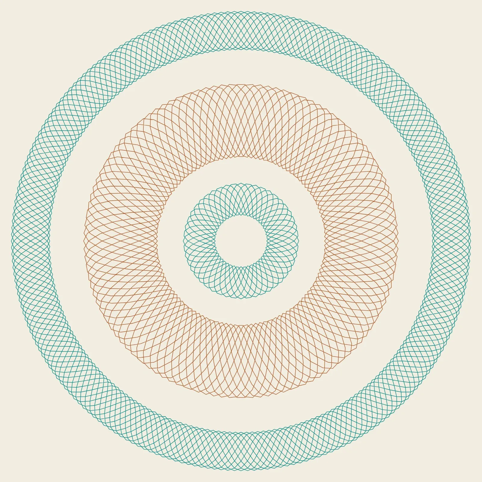
The home page artwork, cropped to 4:3. - 34
Oval badge
.ellipse, .ellipse--solid, text-sm to text-4xlA short word in an oval, in lowercase. Plain or solid. It takes the size of its text, so a text utility sizes it, never below
text-sm.- New
text-4xl - New
text-4xl - Draft
text-xl - Old
text-base - Sold
text-sm
- New
35–37
Titles, menus and footers
- 35
Footer
.site-footer, .site-footer--barThe traditional footer, as at the end of every page here: the name and a note on the left, the site's links on the right. It stacks on a phone. Plain, or on a dark block.
- 36
Menu
.menu-list, .acc, .submenuThe big lines in the panel. An item with sub-items opens as an accordion, with a plus that turns to a minus. Open Work, then Projects.
- 37
Page title
.page-title, .page-title--barOne big title in place of a hero, as on Forms. The dark version, on Work, ends in a thick accent rule.
All work
38–43
Ornament
- 38
Scotch rule
.rule-scotch, .rule-thickA thick line and a thin one, read as one. It opens each section.
- 39
Fleuron rule
.rule-fleuronA pause in the page, drawn with the font's own fleuron. Once a page at most.
- 40
Plate
.plate, .plate-cornerA framed quotation or title. One to a page, never around an image or a control.
For a quotation, a title page or a certificate.
- 41
Notice
.noticeOne note a reader must not miss, marked with the font's manicule.
Save your work before you close this page.
- 42
Rosette
Rosette.astro, .rosetteEngraved line work in the two metals, for a page with no picture of its own. It follows the theme.
- 43
Marks
Mark.astro, .markTwelve drawn icons in one pen. A mark may stand beside its label; alone, its control needs an
aria-label.- menu
- search
- next
- open
- close
- journal
- write
- letter
- save
- leaf
- date
- place